Friday, 28 June 2024

Photoshop Study (8)(double-page spread)

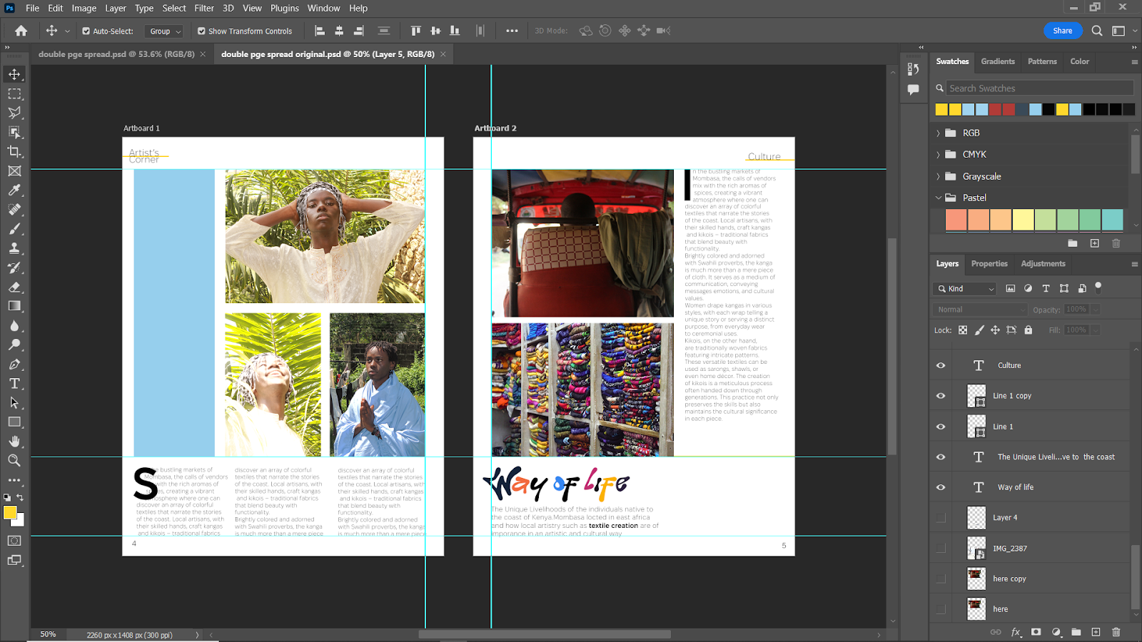
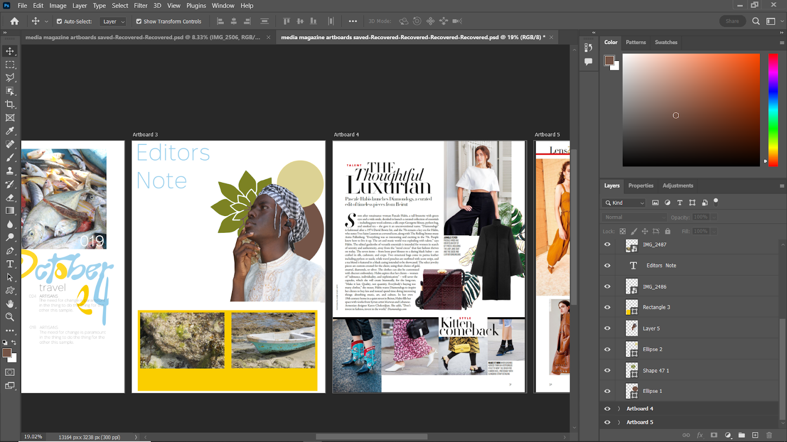
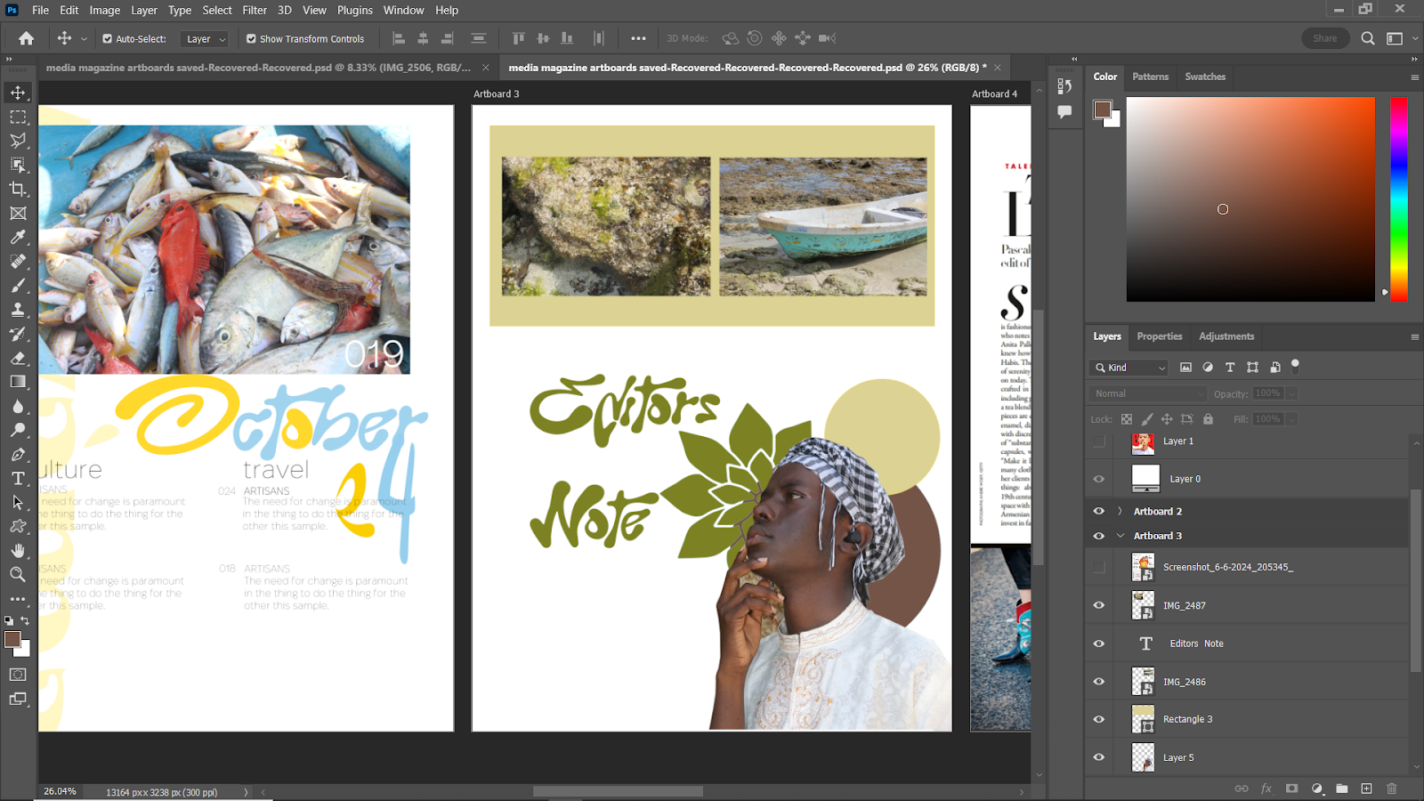
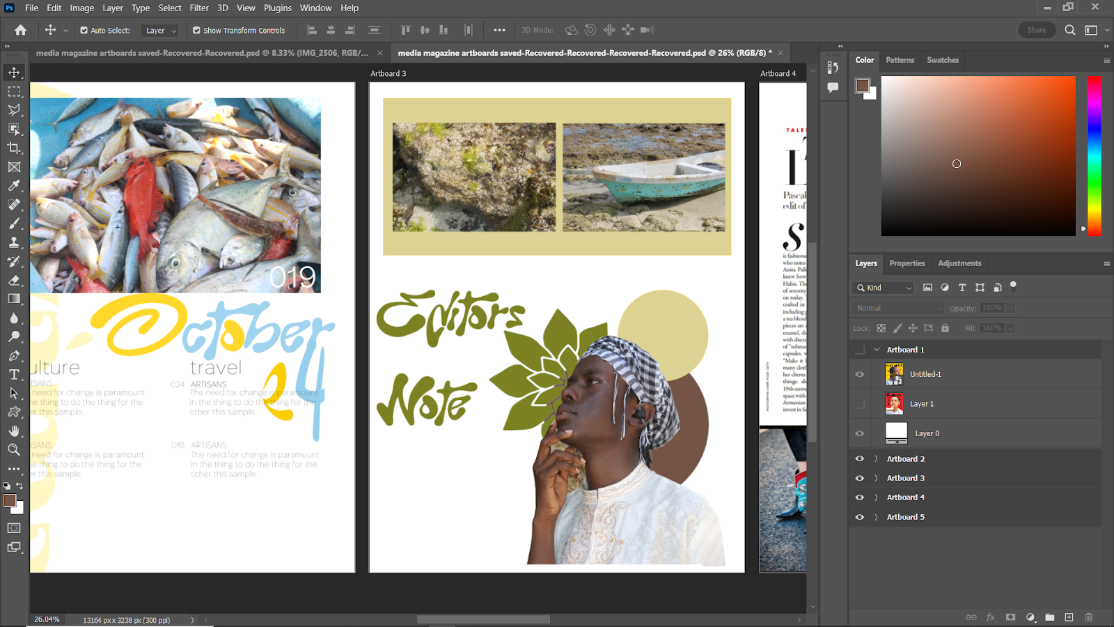
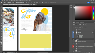
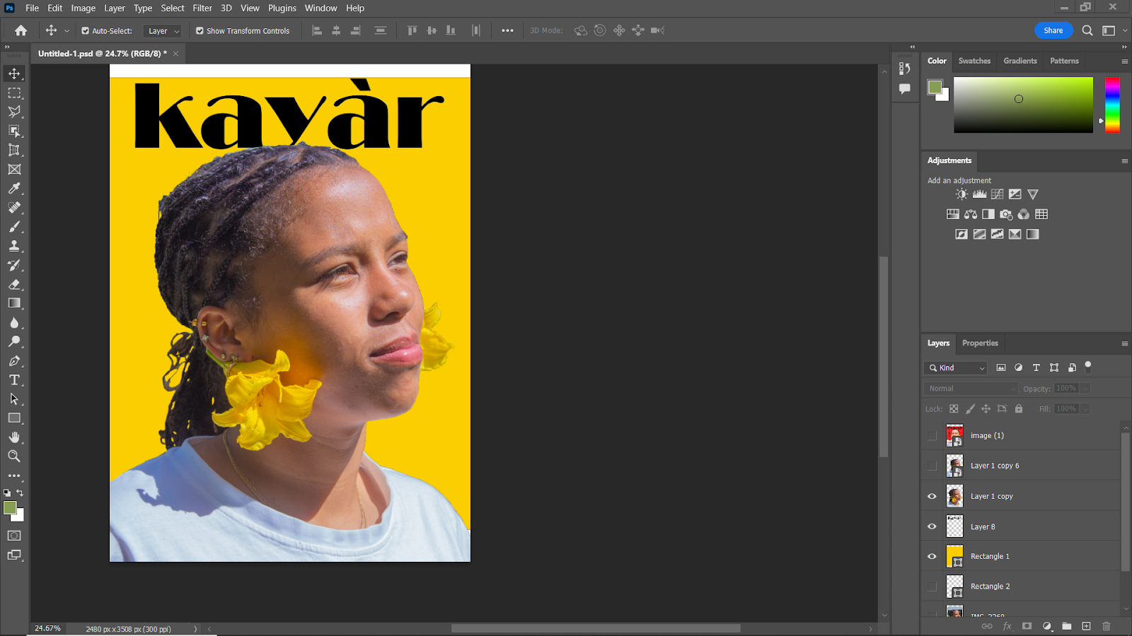
 As you can see i began finalizing the last design but thought  the design felt out of touch with the rest of my magazine so i desided to make some major changes and do a full page picture and article on the other side.

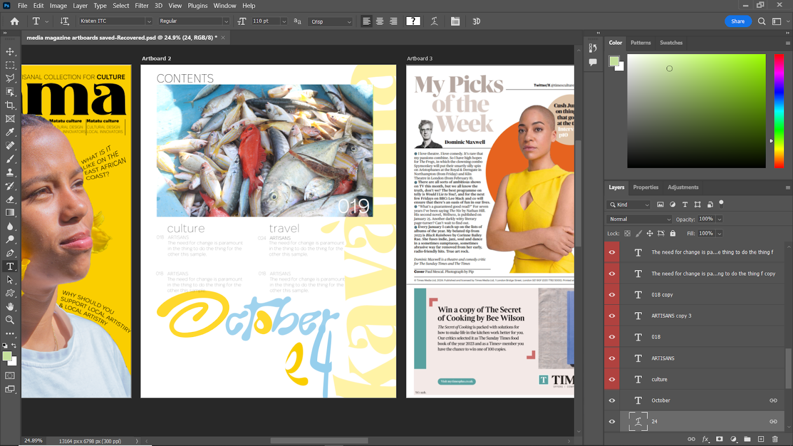
The arrangement and layout i decided on was inspired by the singapore june magazine study i did earlier.


I then added some design elements to match the overall magazine design

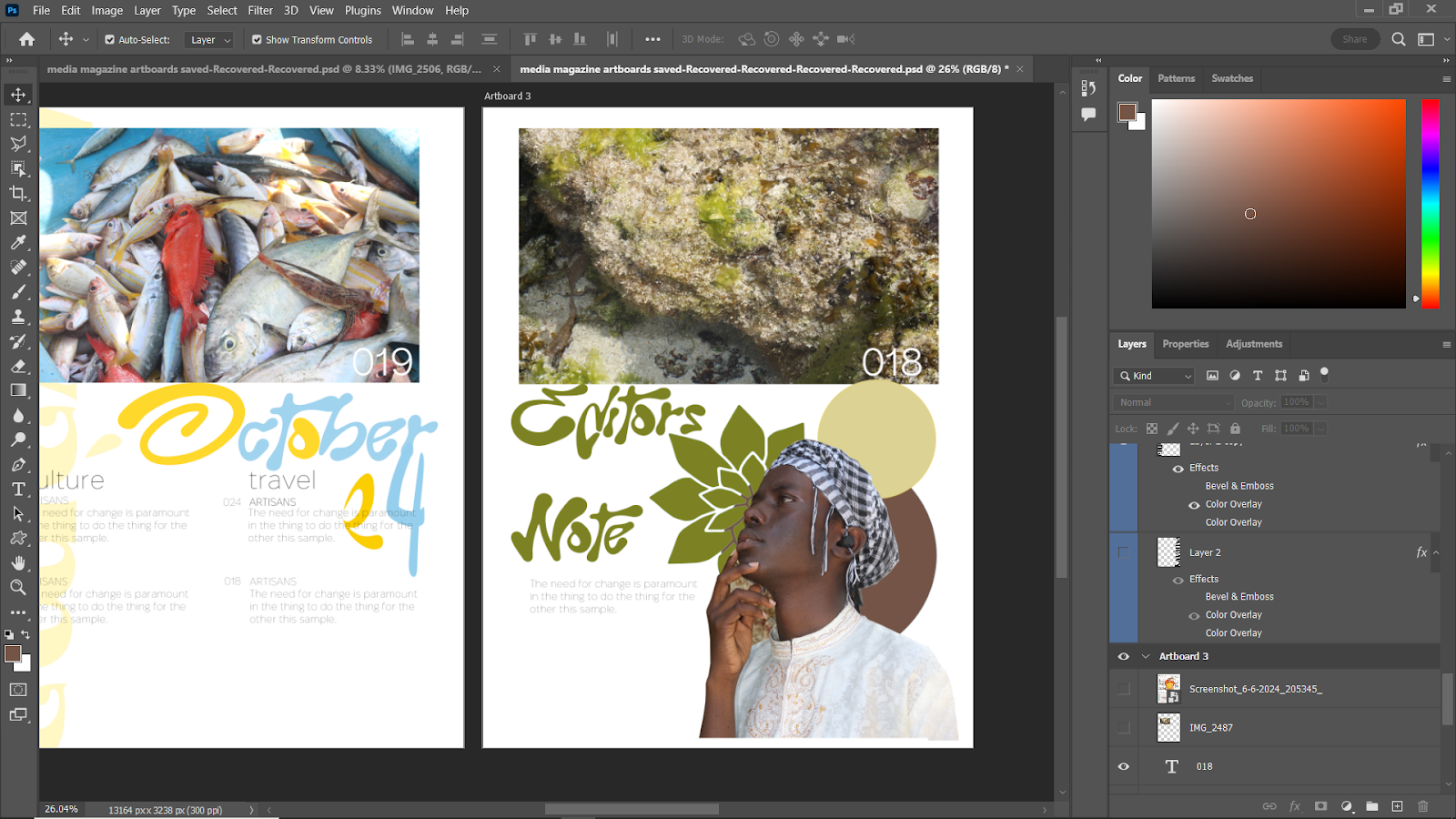
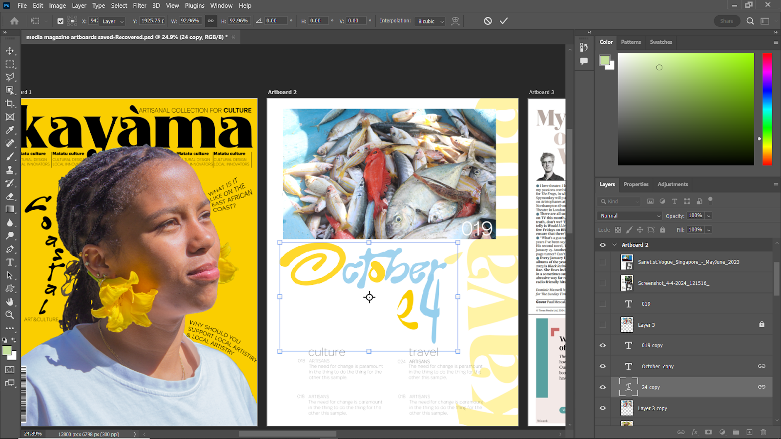
I then wrote the article interview of the textile creator/ fashion designer of whom i gave the name 'Enzi'


I then wrote about their inspiration and creative practice for abit and included a quote from possiblly an interview they did recently.


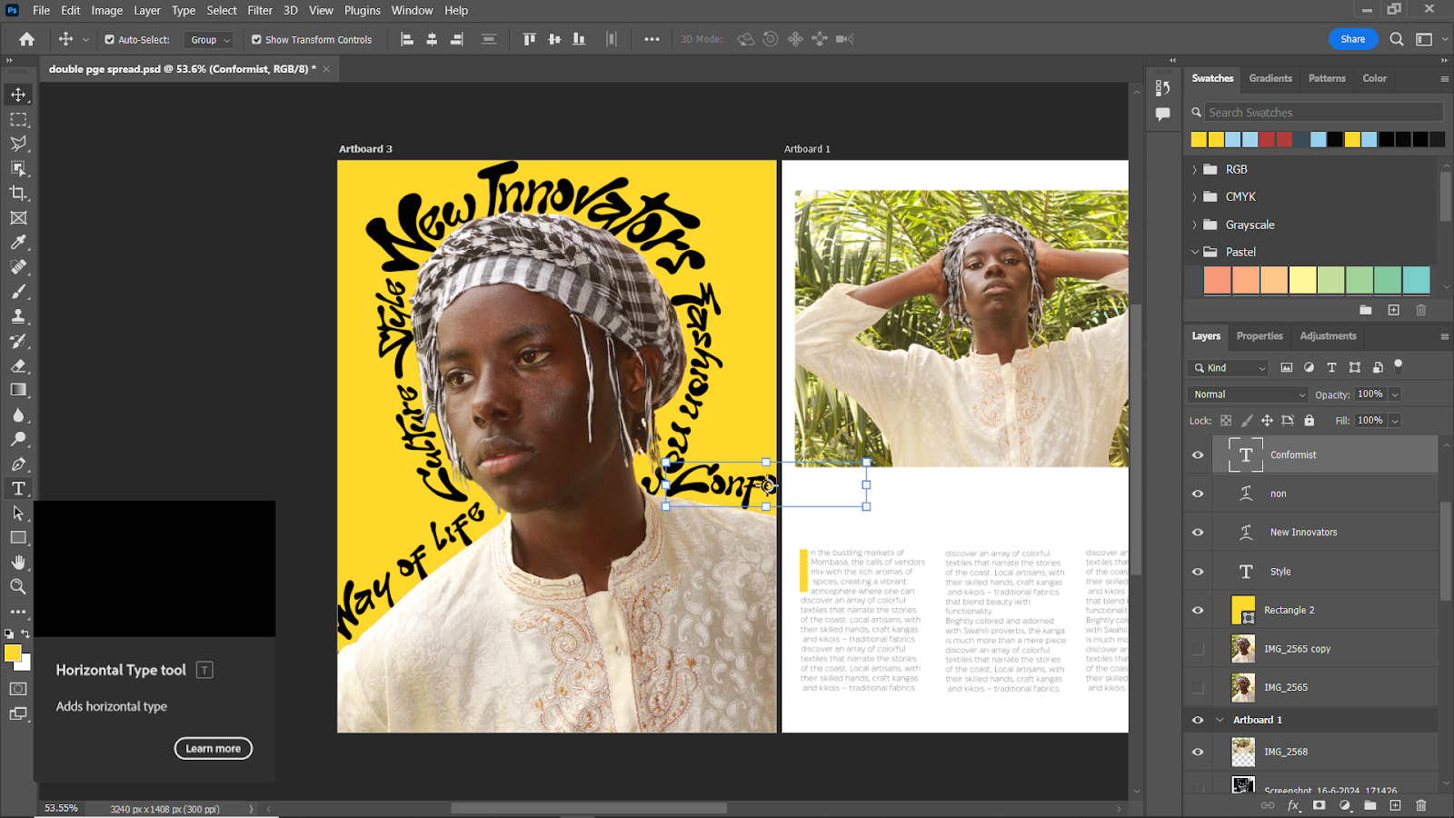
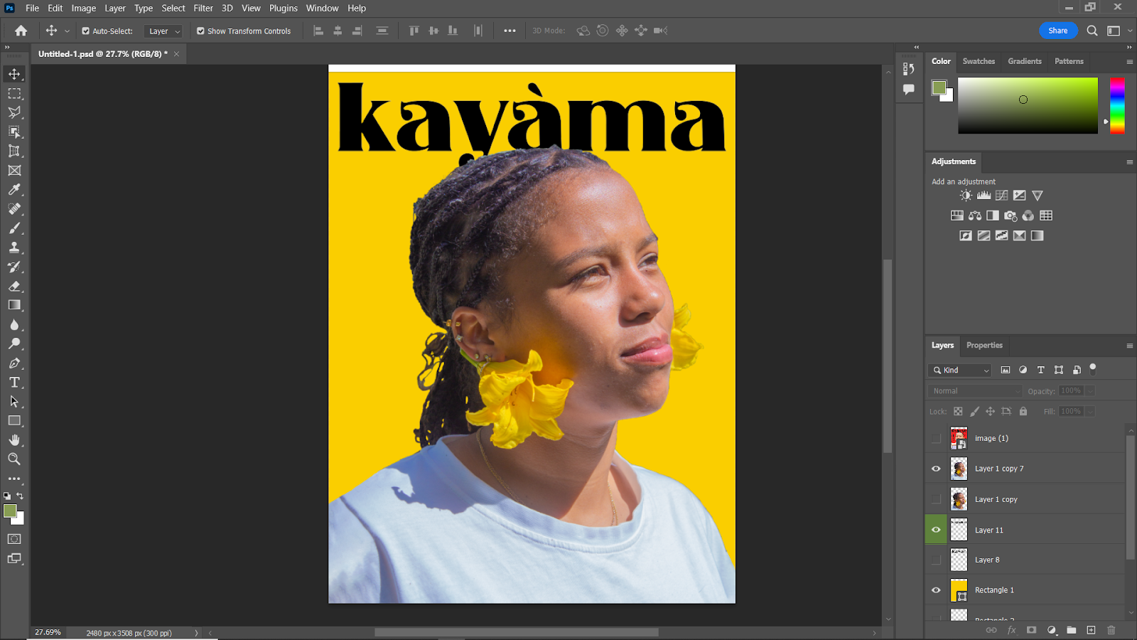
my pages for the  magzine i was doing this was my favourite page, even thought it took the least time it had the biggest payoff, since i used the skills i had gotten from the fisheye inspired magazine recreation


Here is the Final mock Product:


Thursday, 27 June 2024

Photoshop Study (7)(double-page spread)

 for the double page spread, i found it fairly easier to do a i had laid out the fundamentals of the magazine design style and just replicated them in a simpler way to accentuate the pictures and content of the magazine


As i Began I wanted to do two pages on on the right to feature wy of life in the cost and the left to be a small interview or feature of a ficticous fashion designer, as the pictures used were of me directed by me.

(photos showing progress)


Wednesday, 26 June 2024

Explaining contents page elements

When writing the contents I made sure to implement a section on travel tips and most importantly how to travel with intent and having the locals and enviroment in mind which is a big issu, also keeping in min to add books that represent social groups or things that might be under-represented like african literature hence why local literature is featured like kenyan author Ngugi wa Thiongo in the editors picks

(Photoshop study) (6)(content page)

 I then added the text near to the ocober 24 design and was happ with my result so then i decided to do the second page as i wanted a double page spread.


I started being inspired by the culture magazine for layout here

i decided to not deviate from original colour scheme


I was happy with the layout but at the bottom i wanted an editors picks for maybe books or music so i made that added  it in, to the right i also added in a ficticous team list and also decided to not add my own name in the editors note or the team members, i also wrote the editors note as what was there before was just filler text.


Here is the Final Product:


Tuesday, 25 June 2024

(Photoshop study) (5)(content page)

 Here I'm going to show the process of making my contents page and the inspiration i used from the studies I've done.

The images that have no annotation are just to show my progress as i changed my idea alot.


So I started off by adding a water mark inspired by the vogue magazine i did


I then Started placing images and expirmenting with different typefaces for the content pages


I added in my text 


Monday, 24 June 2024

Culture: The way of life - Content For Magazine Double page spread+

 I decided  to write down my magazine content on paper first and now i'm going to transfer all the writing i have done to i can put it in the magazine


In the bustling markets of Mombasa, the calls of vendors mix with the rich aromas of spices, creating a vibrant atmosphere where one can discover an array of colorful textiles that narrate the stories of the coast. Local artisans, with their skilled hands, craft kangas and kikois – traditional fabrics that blend beauty with functionality.

Brightly colored and adorned with Swahili proverbs, the kanga is much more than a mere piece of cloth. It serves as a medium of communication, conveying messages, emotions, and cultural values. Women drape kangas in various styles, with each wrap telling a unique story or serving a distinct purpose, from everyday wear to ceremonial uses.

Kikois, on the other haand, are traditionally woven fabrics featuring intricate patterns. These versatile textiles can be used as sarongs, shawls, or even home décor. The creation of kikois is a meticulous process, often handed down through generations. This practice not only preserves the skills but also maintains the cultural significance in each piece.

Sunday, 23 June 2024

FlatPlan

i arranged my ideas of placement for my double page spread and contents page as a guideline, even if i try to expirement on what looks good or not


Contents Page


Double page spread


Saturday, 22 June 2024

Photoshop Study(4) (fisheye magazine inspired expiramentation)(Cover)

 Here I am going to document the  editing process on the editing of the cover page inspired by fisheye magazine. First draft.


This is the picture/refrence I will use from this photography study I did earlier 


and here are the potentioal inspirations i will use:


the editing process:

I started off by adjusting the image itself by putting back some light in the photo as well as reducing colour temperature and adding vibrance as well as a slight tint


  • I then began to remove the background and add in a solid colour background which is common in the fisheye magazines 


  • 3Then I needed to choose a colour so i went for green I didn't really like it so i then did yellow to match the flowers and i loved it it also alightly matches matches with the style of this issue of fisheye magazine, i also cleaned up the focal image and added text similar to the fisheye eye font with a potential magazine name.


  • At this point i don't like the way the font is positioned as the magazine name is too short and the y is being obstructed making it look odd so i changed the magazine name into a similar 7 letter word


  • Ok i Like the font and position as well as name, i thought of changing the font colour but ive decided to do that after all the text is layed out. Now I'm thinking of content for the rest of the magazine parts aswell as the theme of this specific issue.
  • I added a barcode aswell as some lines to add text similar to the fisheye magazine and did some typography research to find fonts that would go well with my magazine, i also changed the background colour as expiramentation as the yellow background was starting to not look good anymore as it didn't bring out the colours of the image. now i'll go into add the subject matter and content of the text in the cover page and see what it looks like.
  • I then began to expirament with text  and placement and arrived here but it felt bulky


So then i removed the elements i didn't like and this is my finished product.                      along the way i expiramented to try find a potential final product here are the outttakes that i didn't win against the final product:


Thursday, 20 June 2024

Magazine flatplan(1)


to plan out the fisheye magazine inspired cover page using the photography studyv i made a flatplan to conceptualize my magazine plans in my head first 

I made sure to include the appropriate codes and conventions studies including my own thoughts and ideas


Canva(presentation) Link

Below is my canva presentation link with my final creative critical reflection.  https://www.canva.com/design/DAGRyUQ-vfU/Qynbb32cgbjQq7hZWu...