Here is my second questionnaire link
Tuesday, 9 April 2024
Sunday, 7 April 2024
Deeper Distribution/ Audience research
Existing magzines like Vogue from my secondary research, conduct detailed audience research as seen in the vogue article below where they see spending patterns and consumer prefrences:
So i began creating another questionnaire to better understand my audience with more useful/insightful questions such as
1. How often do you engage with arts and culture content (e.g., films, magazine , visual arts, music, etc.)?
Daily
Weekly
Monthly
Occasionally
Never
2. What type of art forms interest you the most? (Select all that apply)
Visual Arts (painting, sculpture, photography)
Literature (poetry, short stories, novels)
Music (traditional, modern, instrumental)
Dance (traditional, contemporary, street)
Theatre and Film
Fashion and Design
Other (please specify)
3. What kind of content would you like to see in a Kenyan Issue of an arts and culture magazine? (Select all that apply)
Interviews with local artists
Reviews of art exhibitions, films, and events
Features on Kenyan history and heritage
Profiles of up-and-coming artists
Discussions on contemporary culture and trends
Tutorials and how-to articles (e.g., art techniques, creative writing tips)
Other (please specify)
4. How Much Would you pay for a Kenyan Issue of an Art and Culture magazine? (in ksh)
500-700
800-1000
1000-1200
5. What tone would you prefer for the magazine’s articles?
Formal and academic
Casual and conversational
A mix of both
Other (please specify)
6. How would you prefer to read arts and culture magazine?
Print (physical magazines, books)
Digital (online magazines, blogs, websites)
Other (please specify)
7. How frequently would you like to receive new issues of the magazine?
Weekly
Bi-weekly
Monthly
Quarterly
8. What would motivate you to subscribe or engage regularly with a Kenyan arts and culture magazine?
Exclusive content
Events and workshops
Networking opportunities with artists and cultural leaders
Discounts on art or event tickets
Other (please specify)

*research questionnaire
Monday, 1 April 2024
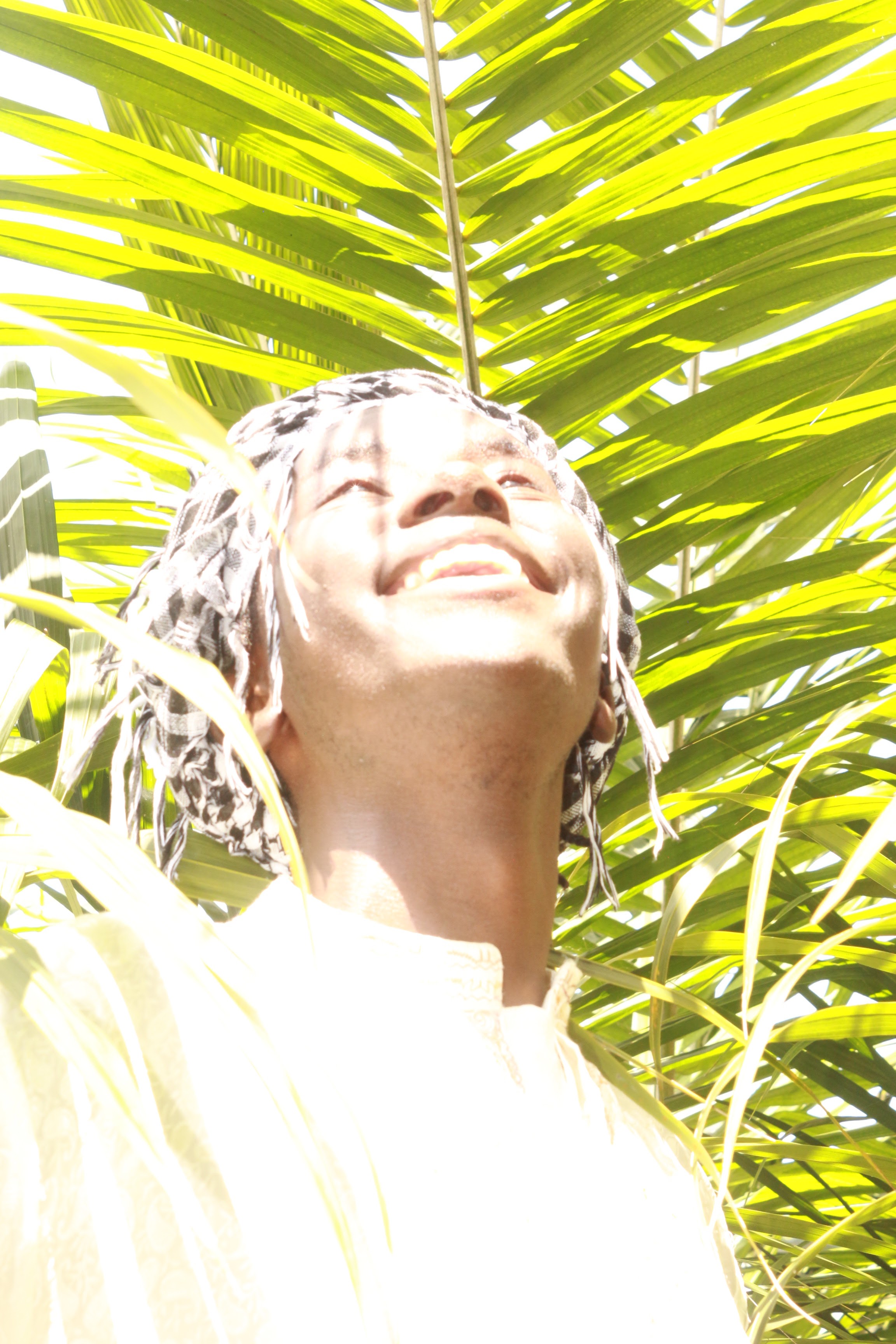
Photography Study (2)

Here I was expiramenting with nature and fashion in potrait photography this would be good inspiration for a cover page concept. The lighting is very interesting and hope to expirement more with potrait photography.
Saturday, 16 March 2024
photography study (1) (the outtakes)

- All these images are the outtakes from the photoshoot of me that i directed that i don't think are good but they might be useful for future refrence.


Friday, 15 March 2024
Photography study: Art &Culture
To explore the photography that is common within arts and culture magazines I directed my dad to take pictures of me while observing certain angles, lighting and background options.


- My favorite picture I took is this one I directed my dad to cut off the mid bust to make the picture look more editorial.

- here I said we go into low light to take the pictures and increase the ISO as an expirament but it didn't work out.
- here the light was too much although I actually liked the effect of the angle, background and pose as well as lighting it felt aesthetically pleasing but not editorial.
- I directed for the ISO to be increased here as an expirament

- more versions with lower angles

- here i directed a wide angle shot which i really liked and i might actually use this for my editors note on the contents page.
Thursday, 7 March 2024
Vogue Arabia December 2017: (codes and conventions)+inspiration (2)
Here I will analyse the December 2017 issue of vogue Arabia and how the different magazine elements and norms help it communicate art and culture and what i would like to pick from these
Here's the:
- Cover page

- I really love this cover page as it has elements of both art and culture. In terms of typography 3 fonts but they have been used in both lowercase and capital letters to ive the illusion that many fonts we're used. the composition and framing of the model is something i'd like to use.
- The masthead has been partially covered by the model in the editing part i'd also like ot do that.
- Contents page + editors note

- the arrangement here differs only slightly from the first magazine but i've noticed the vogue arabia uses a more expiramental photo arrangement and many different fonts especially in the contents page
- Editors Note


- h The following editors not is more creative although it seems that itcould be a more creative use of space.
- Double page spread

- I really really like the cutout aspect of the outfits this coupled with a somewhat stick and paste style of arrangement of this magazine i want to take from. the colour coding on the right hand side is also really nice and though it's simple the attention to detail makes it look good and i hope my magazine takes from this.
- Another Intruiging this is the fashion photography and poses which is to note if i'm doing fashion photography
- i love the maximalist photobook design too but i wish it was more colourful in terms of font and maybe more expiramental. hopefully i'll implement that in my magazine
Friday, 1 March 2024
Vogue Singapore May/June 2023: (codes and conventions)+inspiration (1)
Here I will analyse different issues from vogue ? and how the different magazine elements and norms help it communicate art and culture and what i would like to pick from these.


I will analyse the:
- Cover page
There seems to be a common convention of such magazines with a colourful masthead and minimalistic design with minimal or no coverlines etc
- contents page+ editors note

- The vogue style of the contents page excludes the editors note which I like, but what stands out to me is the more simplistic Font and the VOGUE watermark at the back is effective to fill empty space, whether this is typical for an arts&culture i feel it's abit muted and i would like to do more with the contents page.
- For what I love is the alignment for this page and the model esque picture it makes up for the minimalism
- As for Codes and conventions contents pages seem to incluse column text with a serif font, however im choosing to deviate and have a non-serif font

- my thoughts on this page of the cover page are similar to the last what i like about this is the colour cordination of the picture on the top and the watermark
- Common with the other magazines there is a preview image of sorts showing a preview of an intruiging magazine page which i wish to adopt.

- my thoughts on this page of the cover page are similar to the last what i like about this is the colour cordination of the picture on the left and the watermark
- editors note

- the editors note or here as it is called an editors letter consists of the cover and most importantly a picture of the editor himself including a signature. then the text on the right talks about some of the meaning and intentions behind the issue which include some quotes and what the editor genuinly feels
- In terms of arrangment and fonts as well as colour i will admit i don't find it the most appealing but there are differences in the title font which adds some pop. perhaps this is to empasise the cover on the bottom left.
- Analysing the conventions of most content pages i wish to deviate from this
- double page spread

- perhaps i'll use this layout when presenting an interview in my magazine as it is effective and catches the eye
- The use of differing typography styles is common within this genre
- It is evident a grid is used to ensure symetry
- The featurette here shows a main image and a supporting one featuring the artist this layout is good at catching the eyes to 2 central points
- the tone of the article is a mix of formal and slightly casual which is good to note
- double page spread

- Such magazines seem to go for simplistic and minimalistic layouts but put twist on them, the use of creative differing fonts seems to be a common as it looks clean and presentable which i like, however i will likely to deviate from this and have the same feel but more colourful and slightly more expressive to cater to my younger audiences
Subscribe to:
Posts (Atom)
-
Below is my canva presentation link with my final creative critical reflection. https://www.canva.com/design/DAGRyUQ-vfU/Qynbb32cgbjQq7hZWu...
-
fisheye magazine caught my eye when i was looking into new the new aesthetic mentioned in the last it's almost exactly the direction i w...
-
.jpg) i-D is a popular British based magazine that has BI-monthly issues which focus on art, music, fashion in terms of audience they cater to a ...
i-D is a popular British based magazine that has BI-monthly issues which focus on art, music, fashion in terms of audience they cater to a ...
